Game Settings
My role
UX/UI Designer, UI Artist
Duration
June-July 2023
Overview
The project began during my time at PlayStation and evolved into a personal passion.
Through careful observations and analysis of settings in different games, I worked to incorporate important elements that would improve the player experience and provide clear context.
The design concept for the blueprint aimed for a sleek and minimalistic look while adding a touch of unique style.
Goals
- Explore existing Game Settings to define successful patterns and common practices.
- Design console Game Settings System that would be easy to use and navigate, and provide necessary contextual information.
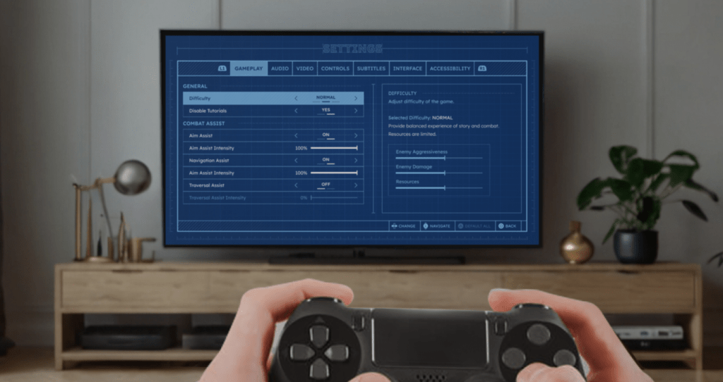
Final Result
Research and Analysis
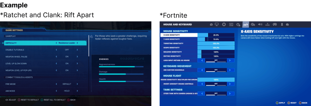
Designing settings specifically for PS5 experience, I analyzed different 1st party game titles. The primary objective was to find common practices and patterns that resonate with players and can be use effectively.
Surprisingly, each game studio had crafted their own unique structures, category divisions, and naming conventions.
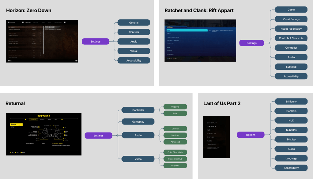
That was a great opportunity for me to identify strengths and areas of improvements of competitors to develop comprehensive and thought through Settings interface.
After careful analysis I defined several key areas that needed attention.
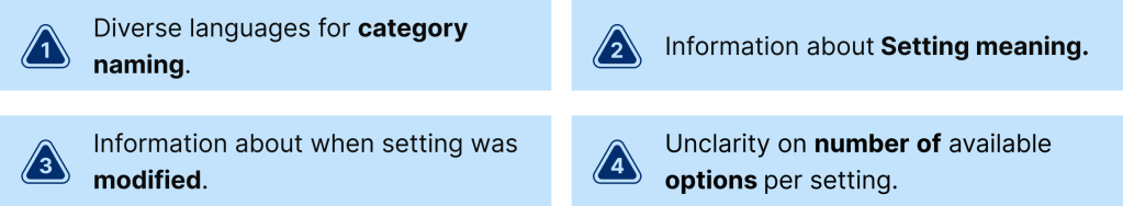
1. Category Naming
In the absence of a standardized naming convention for categories, players may be confused when encountering terminology that doesn’t match their previous experience.
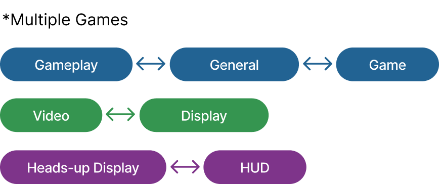
To address this, I conducted player interviews to gather insights on preferred category naming and whether the diversity in naming creates confusion. Overall, players were not significantly confused as long as they could find the settings they wanted to adjust.
Nevertheless, these findings could be valuable for optimizing the organization of settings. To achieve this, I plan to conduct a card sorting exercise once the full scope of settings content is defined.
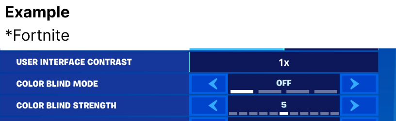
2. Settings Meaning
Since setting titles aren’t always clear, adding a Descriptive Area is a strong approach to provide context and make comparisons easier.
This decision is informed by a common practice in modern games, aligning the design strategy with industry standards.
3. Modified Options
Since setting titles aren’t always clear, adding a Descriptive Area is a strong approach to provide context and make comparisons easier.
This decision is informed by a common practice in modern games, aligning the design strategy with industry standards.

3. Number of Available Options
For settings that offer multiple choices, providing a numerical indicator is an effective method to convey the quantity of available choices, ensuring clarity and ease of navigation for users.
Tabs vs Deep Navigation
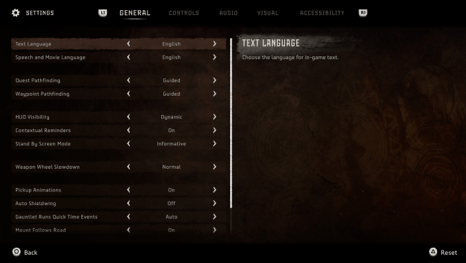

Tabs Structure
Pros: enhances visual clarity and simplifies comprehension for players allowing for effortless scanning and associating settings with their respective categories.
Cons: a limited number of categories that can be accommodated within a single row. Localization adds to this equation.
Deep Navigation
Pros: the system allows a greater number of categories in a vertical arrangement. This approach affords the opportunity for more descriptive category titles.
Cons: the process of toggling between categories and the setting lists may introduce cognitive overload, potentially leading to difficulty in remembering the options under each category.
Project Solution
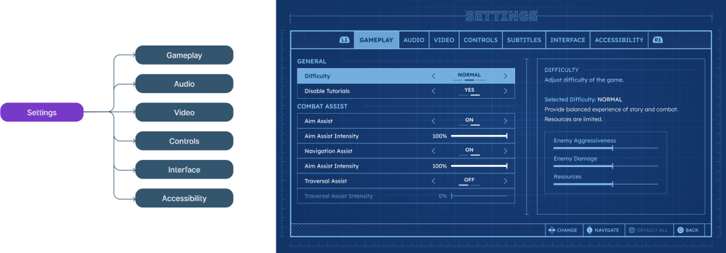
For my project, I decided to go with the Tabs Structure approach, prioritizing player comprehension and ease of use. The structure of categories is defined from a combination of competitor research and insights gathered from player interviews. However, to conduct a thorough analysis of the settings content, it is essential to finalize the content itself.
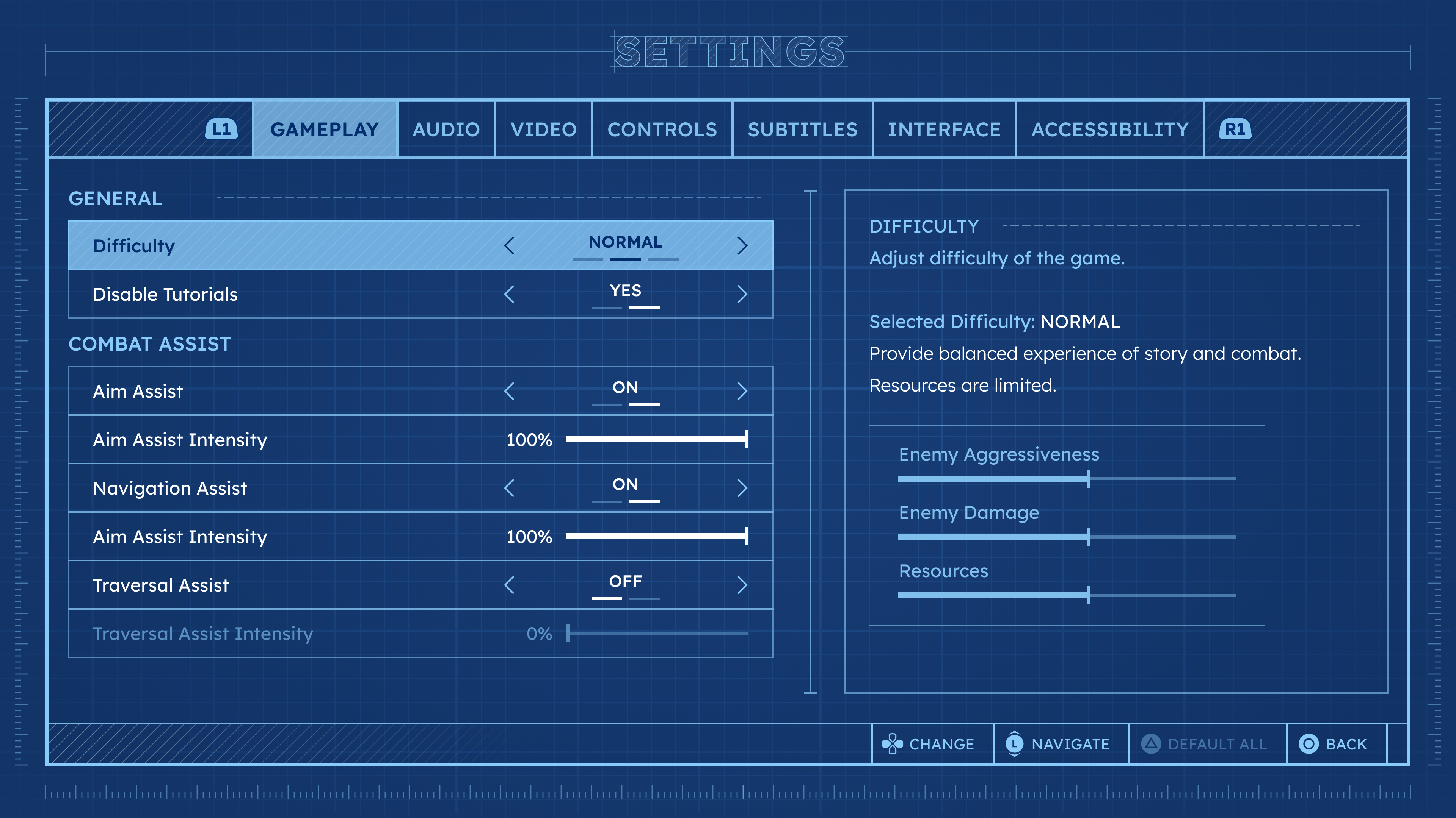
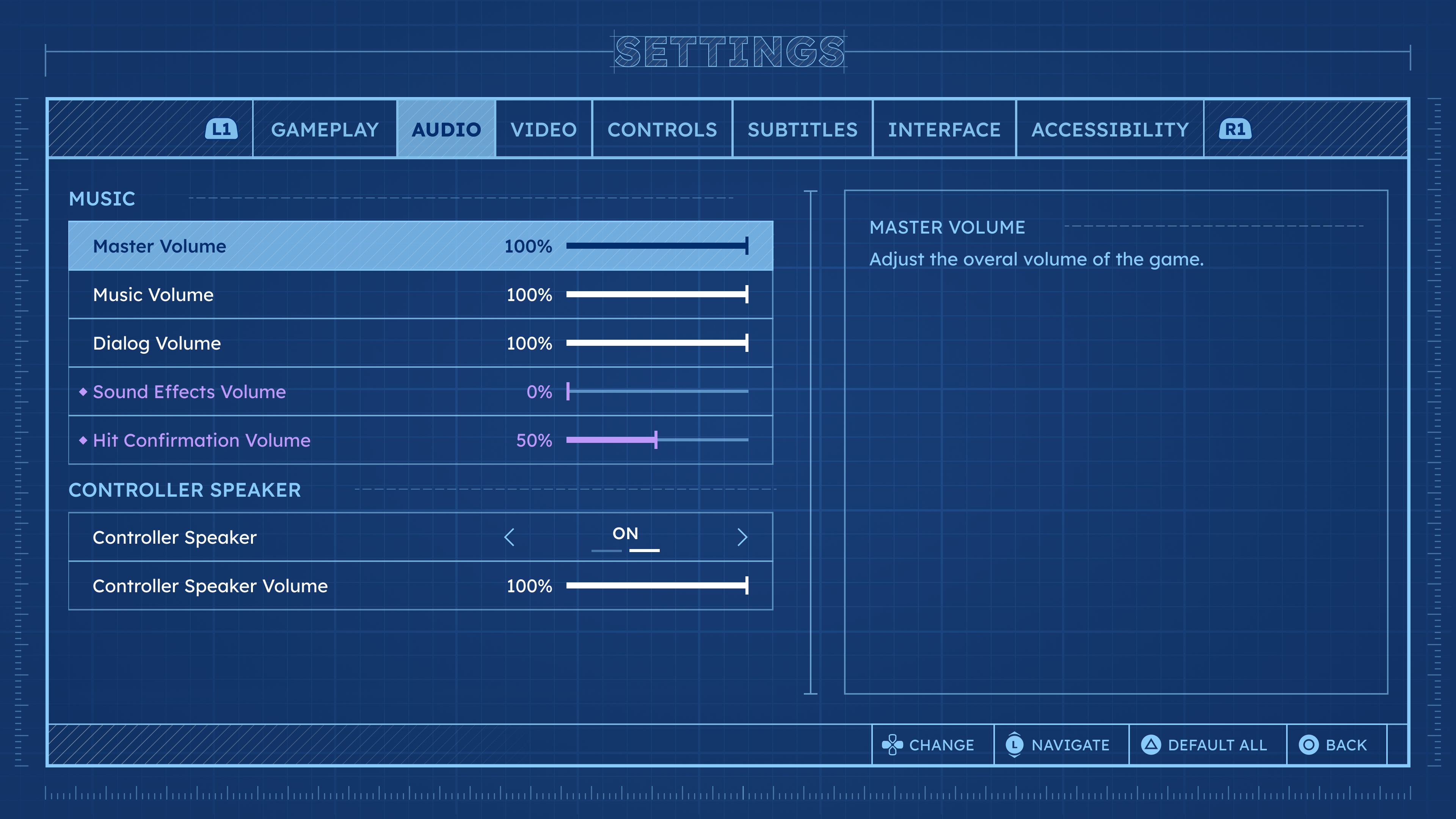
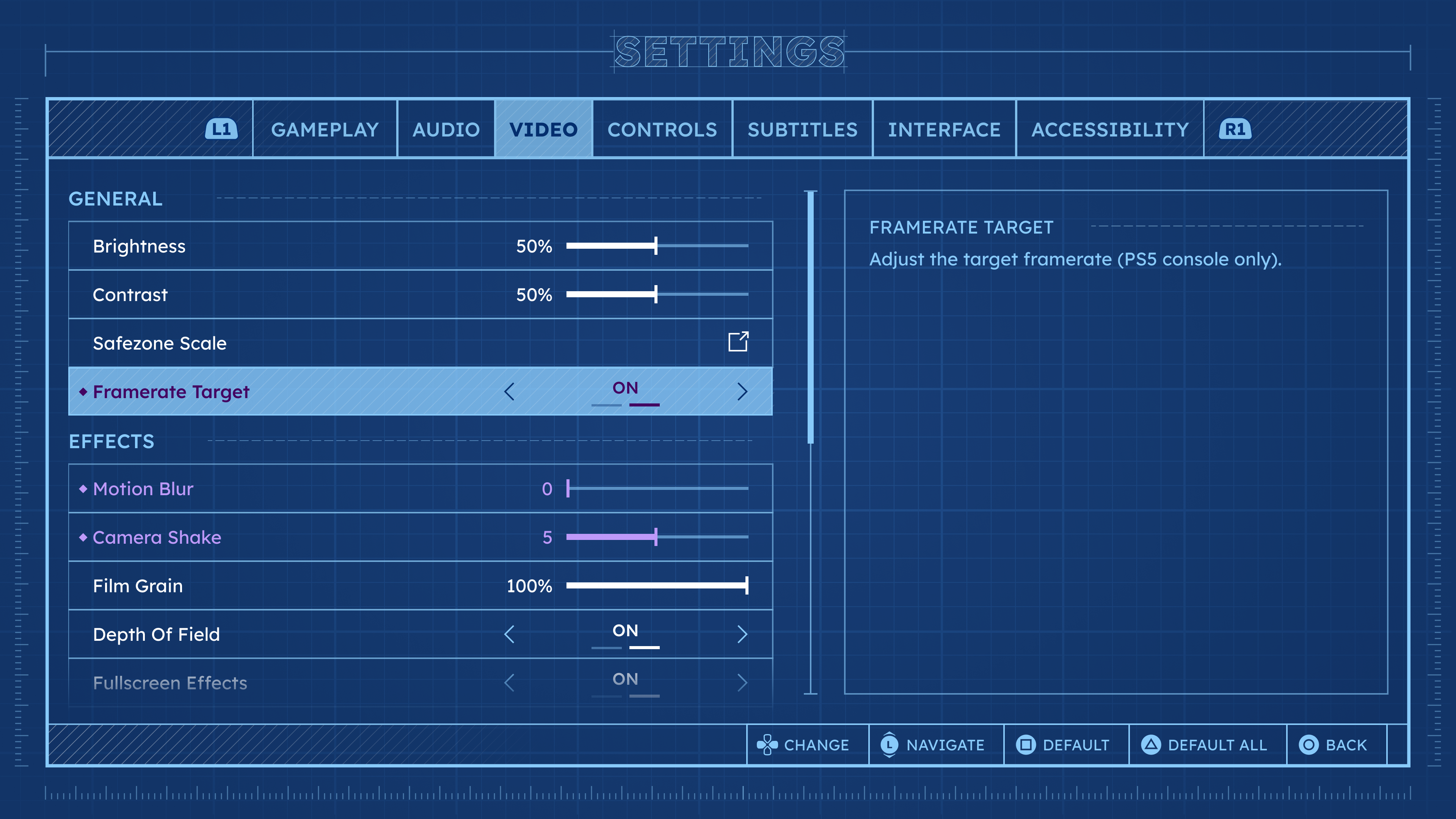
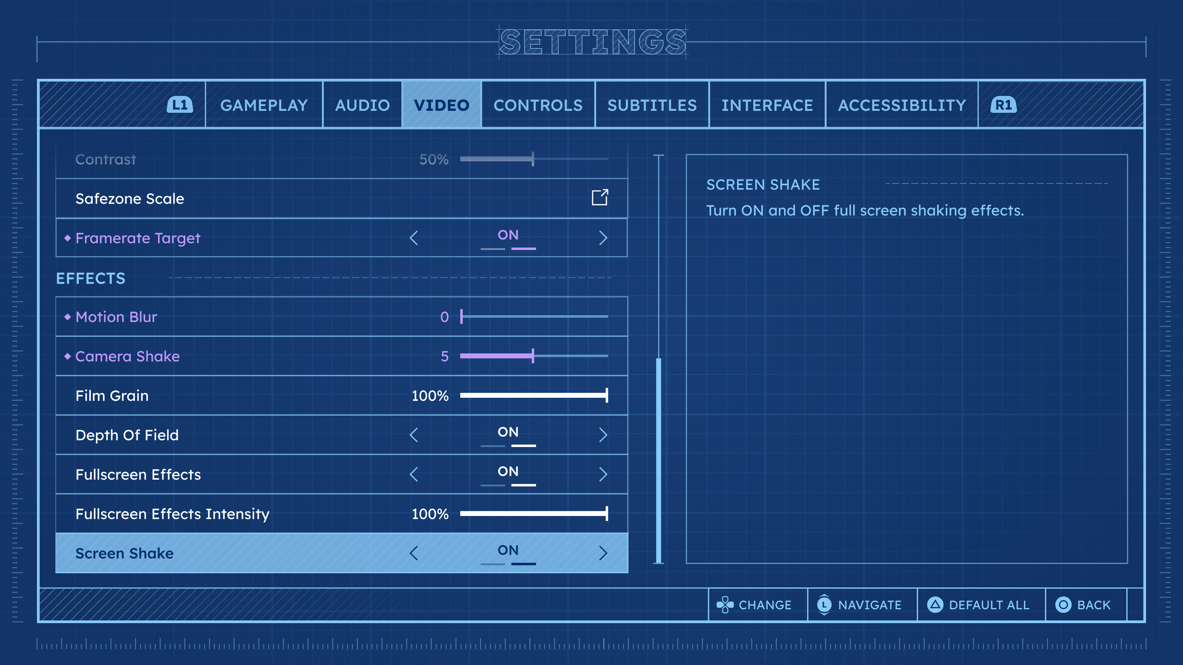
Menu Anatomy
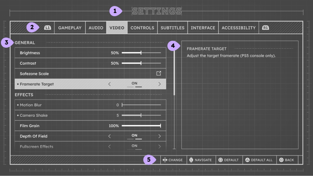
1. Screen Title
Decorative title of the screen.
2. Settings Tabs
Settings navigation.
Preferably number of tabs is limited to 8 due to wide constraints.
3. Settings List
List of settings rows that can be modified.
Scrolling bar would appear if the number of lines is bigger than designated area.
4. Descriptive Area
The widget can contain different types of information: text blocks, images, videos, sound samples…
5. Footer
Button Hints area. Right aligned not to interfere with the information in settings list.
Settings Rows Types and States

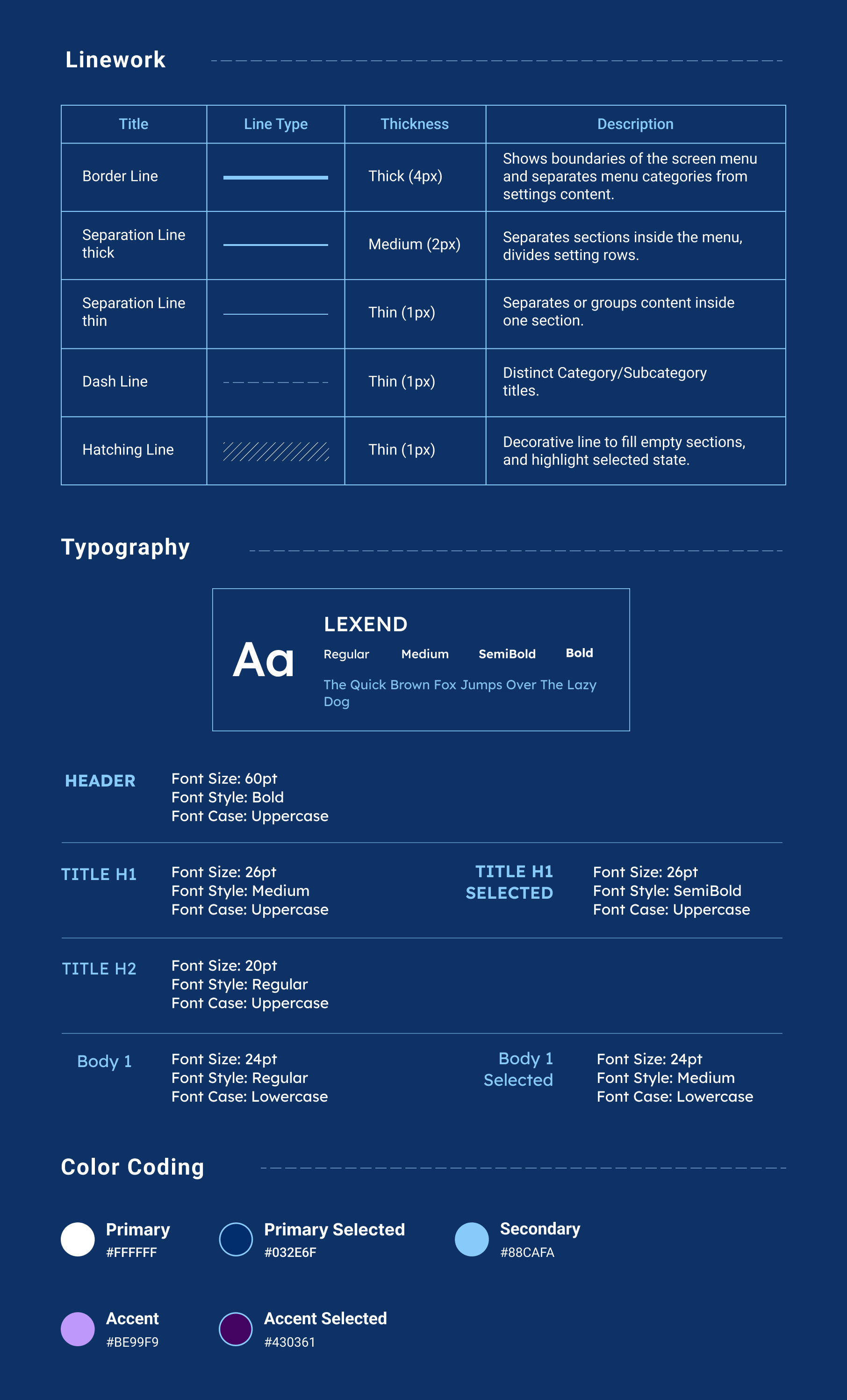
Style Guide