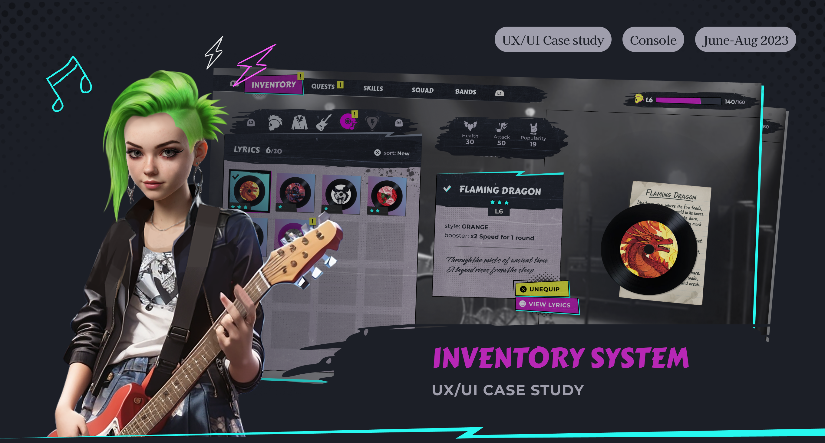
About the Project
This project was created for the UX/UI Community Challenge with the goal of designing a Character Management system (Inventory or Loadout) and sharing the design process and outcomes with the community.
My role
UX Designer/UI Artist
Solo feature owner
AI Generation
Most of the 2D assets and characters were created using AI-generated images with additional manual adjustments.
Game Overview
A teenage punk girl sets out to form the best school band and win a music championship. The game blends rhythm battles inspired by Rock Band/Guitar Hero with RPG-style progression.
Core Mechanics
- Perform on stage to win audience reactions and build popularity.
- Customize your character to boost stats and express personal style.
- Connect with other students to recruit bandmates and grow your crew.
Genre: Action Adventure / Rhythm RPG
Platform: PlayStation 5
Style: Grunge, Punk-Rock, Comic
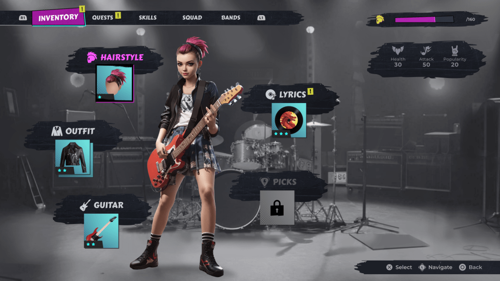
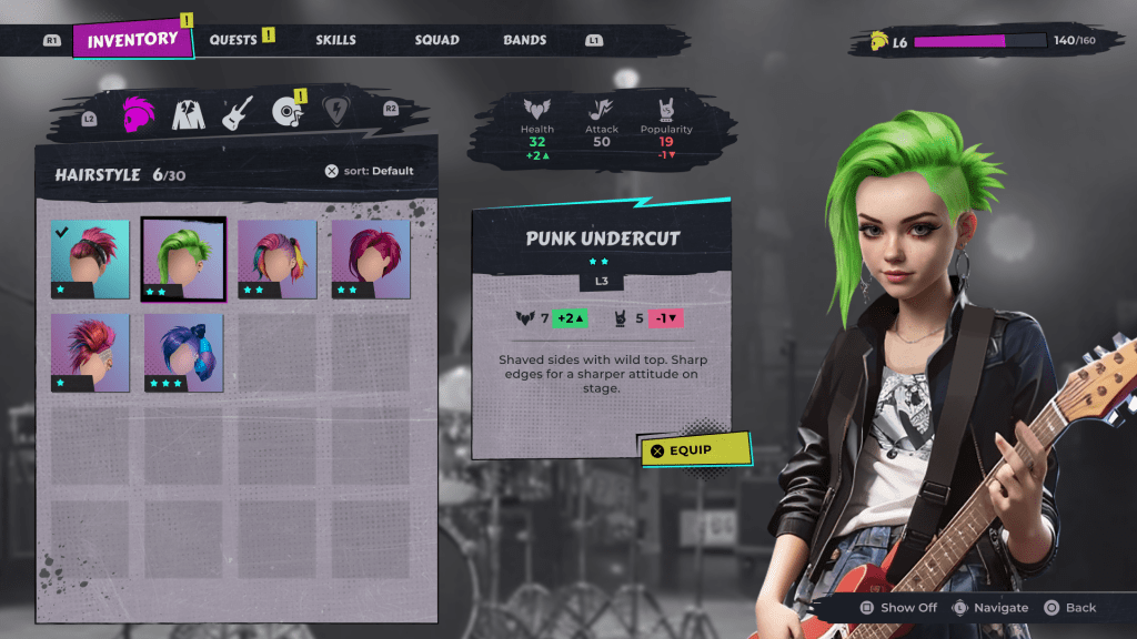
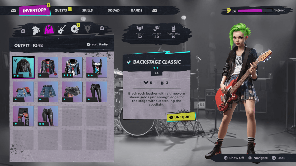
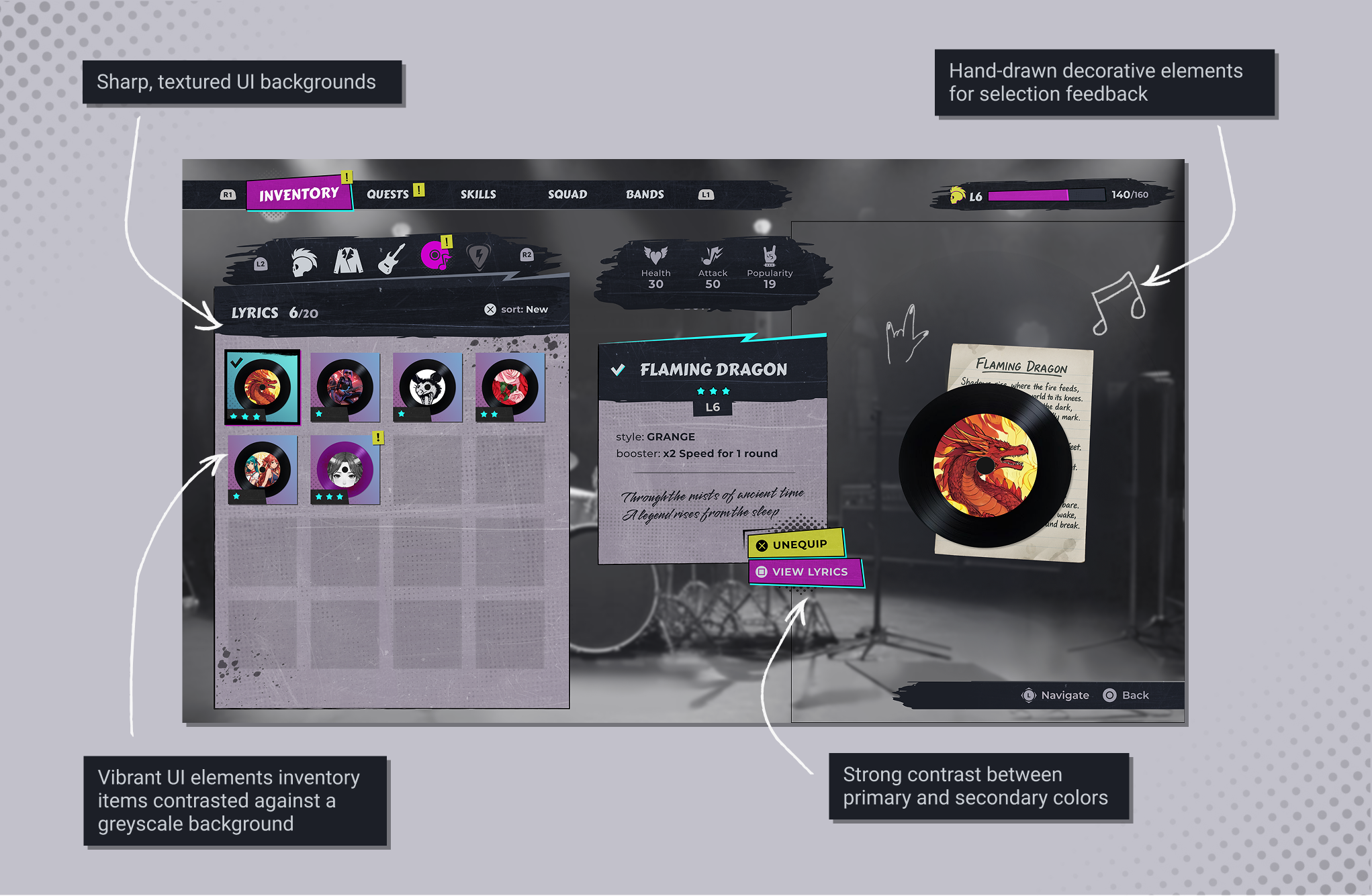
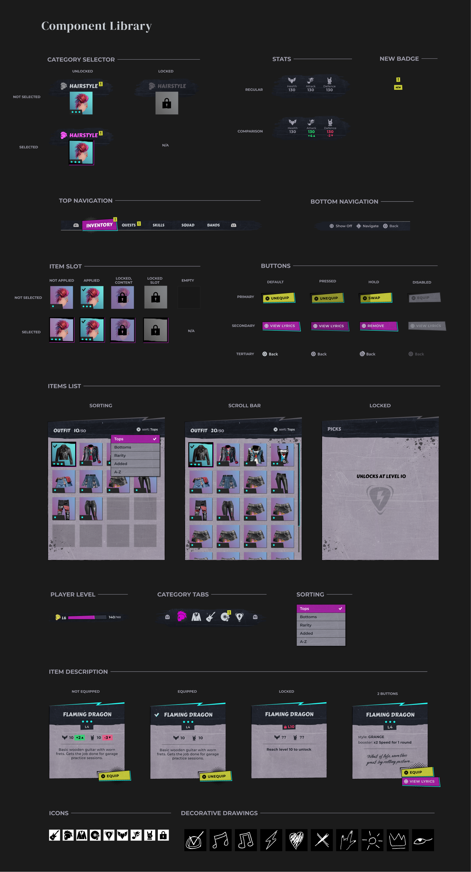
Final Result


Design Process

This project is targeting casual players who value accessibility and immersion over complex systems.
Based on competitor research (Hogwards Legacy, Zelda: Tears of Kingdom, Assassin’s Creed: Valhalla, Love Nikki) I made several assumptions about what Casual players value the most.
- Intuitive user interface: information should be intuitive, easily accessible, and players shouldn’t have to spend a lot of time navigating complex menus.
- Easily comparable: player should be able to understand form a glance what equipment is better suitable for their character.
- Language clarity: UX copy should be clear and player-friendly, with less “heavy” RPG terminology.
- Visually rich and appealing: A vibrant, stylish presentation that enhances immersion and supports the fantasy of being part of the world.
- Engaging storyline: rich and immersive storyline that draws players into the game world.
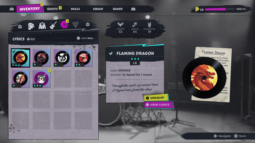
The inventory system is a core feature that fuels both player motivation and business value.
For Players: Customization creates emotional investment. By personalizing their characters, upgrading gear and unlocking rewards, players feel a sense of ownership and achievement. This deepens immersion and makes their journey through the game more meaningful and unique.
For the Business: When players stay invested in collecting, optimizing and showing off items, they are more likely to return, increasing retention. A well-designed system also opens opportunities for monetization through cosmetics, premium unlocks, or limited-time items.

Based on preliminary research, I defined the following goals:

USABILITy
Ensure fast, intuitive access to all customization categories with clear visual comparisons (current vs new), real-time character preview, and flexible filtering/sorting.

Player Motivation
Drive engagement through collection, optimization, and self-expression that directly impacts stage performance and popularity growth.

Ui Style
Build a cohesive punk/comic-style UI that visually aligns with the game’s rebellious tone and serves as a reusable design system for future features (e.g., shop, battle results, band hub).

Informational Architecture
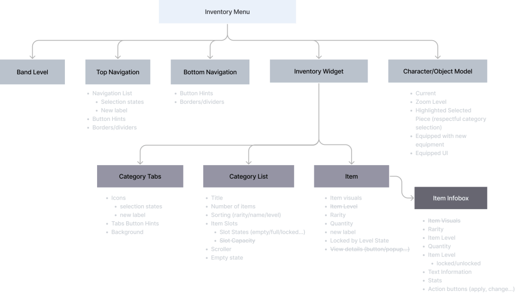
I start by looking into Informational architecture to define the structure of the feature: categories, hierarchies, and relationships between elements.
Basically, answering the question “What information needs to exist, and how is it organized?”
Here I can also define what is a minimum required scope, and what can be enhanced later.
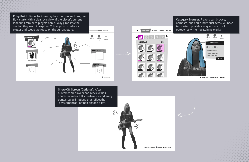
Flow and Entry Point
Designing the user flow clarifies how players move through the system and where their journey begins and ends.

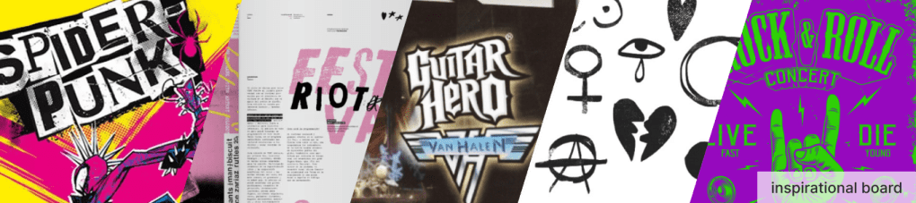
Finding the right visual style for a game is tough. Browsing references sparks creativity, but it’s hard to focus on what truly works.
After sketching multiple ideas and sharing them with the UX/UI community, I received a lot of feedback that was sometimes hard to process. To narrow down the solutions, I defined functional UI pillars to guide element creation.
My goal was to ensure that style and components carried clear semantics, making them reusable and scalable.
Style Semantics
Punk-rock
Rebellious
Vibrant
Imperfect
Shapes and Patterns

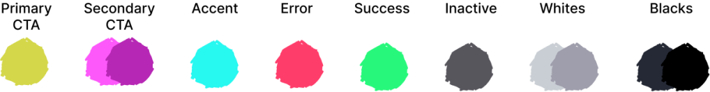
Color Palette
- Vibrant CTA
- Base grayscale/neutral tones for backgrounds and UI frames
- High contrast for readability and focus
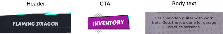
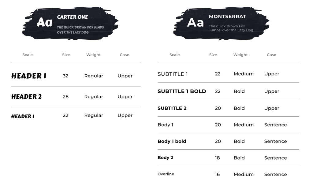
Fonts
- Accent for Headers, CTA
- High-readability sans-serif for body text and labels
- Handwritten/script fonts for decoration
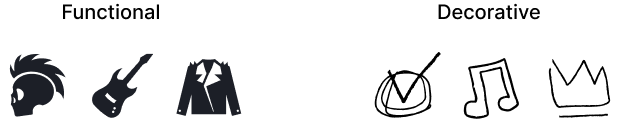
Iconography
- Stylized recognizable silhouettes, inner detailing for functional icons
- Hand-drawn/sketch-style for decorative elements

Colors

Typography

Since this project was a UI concept, I didn’t encounter real production constraints. In a full development environment I would collaborate closely with a cross-functional team, including:
Producers / Product Managers – to align on goals and assumptions
Art Director – to ensure UI matches the game’s visual identity
World & Character Artists – to define feature scenes and character behavior
Game Designers – to align with player motivations and gameplay goals
Motion Designers – to add transitions and animations to bring UI to life
UI Tech Designers and Engineers – to identify technical capabilities and constraints
User Researchers – to test feature and iterate based on player’s feedback
I learned the importance of balancing usability with style, and I hope sharing this process helps other designers and artists approach game UI as both a functional system and an expressive player experience.
